Tattoo: part 1
12:20 PM Edit This 1 Comment »
I've wanted a tattoo or tattoos since early high school.
Many of my father's friends and co-workers when I was little had tattoos. So I've seen a lot from a young age. Many of them on aging wrinkling or fat men. So I've seen how they fade and stretch over time. It's usually a pretty bad look.
I'm not put off however, I'm just cautious. Choosing the place for the tattoo is vitally important, some areas are more prone to stretching than others.
Also, make sure the imagery is significant in some way. nothing sucks more than a tattoo of a swallow or butterfly cos they were trendy at the time.
I've kept a close eye on Bad Tattoos to see what really makes them cliche or just failures.
(Mr Cool Ice is definately my favourite)
So after many attempts at designing a very personally significant image. I've given the fuck up. I just cant get something I'm truley happy with.
Instead I'm going with my most prevailant hobby: geekness
and the image will be inspired by the best game of all time: Grim Fandango
I found only one image of someone with a GF tattoo and it's really quite average.

We must be able to do better than that.
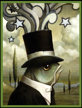
Have a look at some of the GF concept art by Peter Chan:


That amazing Art Deco feel is what I want to capture and I dont have the talent to draw anything even remotely like that. So I'm going to Contact both Peter Chen and Tim Schaffer and see if they could. Manny is a beloved character I'm sure they would want him badly represented.
I will leave it to the proffesionals but a loose idea I had in mind was like this:
Manny from the torso upwards, one arm across the body with the other holding his cigarette in the air. A classic art deco style city in the background, rays emenating from behind.
I'll keep you updated on the design progress.
Many of my father's friends and co-workers when I was little had tattoos. So I've seen a lot from a young age. Many of them on aging wrinkling or fat men. So I've seen how they fade and stretch over time. It's usually a pretty bad look.
I'm not put off however, I'm just cautious. Choosing the place for the tattoo is vitally important, some areas are more prone to stretching than others.
Also, make sure the imagery is significant in some way. nothing sucks more than a tattoo of a swallow or butterfly cos they were trendy at the time.
I've kept a close eye on Bad Tattoos to see what really makes them cliche or just failures.
(Mr Cool Ice is definately my favourite)
So after many attempts at designing a very personally significant image. I've given the fuck up. I just cant get something I'm truley happy with.
Instead I'm going with my most prevailant hobby: geekness
and the image will be inspired by the best game of all time: Grim Fandango
I found only one image of someone with a GF tattoo and it's really quite average.

We must be able to do better than that.
Have a look at some of the GF concept art by Peter Chan:


That amazing Art Deco feel is what I want to capture and I dont have the talent to draw anything even remotely like that. So I'm going to Contact both Peter Chen and Tim Schaffer and see if they could. Manny is a beloved character I'm sure they would want him badly represented.
I will leave it to the proffesionals but a loose idea I had in mind was like this:
Manny from the torso upwards, one arm across the body with the other holding his cigarette in the air. A classic art deco style city in the background, rays emenating from behind.
I'll keep you updated on the design progress.
1 comment:
Mr Cool Ice is the best tattoo of all time.
Post a Comment